Like a lot of homelab setups, my VPN situation was functional but annoying. I run Gluetun in Docker to tunnel traffic through AirVPN, and it works great, right up until I want to switch servers. Then it’s: open AirVPN’s website, squint at server load stats, pick one, edit the environment variables on the Gluetun container, restart it, and hope I typed the server name right.
I did that dance one too many times, so I built myself a dashboard.
What it does
VPN Dashboard is a self-hosted web app that pulls the full AirVPN server list, 256+ servers across 23 countries, and puts it in one place with everything I actually care about: current load, free bandwidth, active users, health status, and latency (there’s a “Ping All” button that TCP-tests every visible server). I can filter by continent, country, or city, sort by whatever metric matters at the moment, and connect to any server with one click. Behind the scenes it talks to Gluetun’s REST API, polls until the new tunnel is actually up, and cleans up the stale AirVPN session from the old server.
The header always shows my current state at a glance: active server, exit location, and whether the tunnel is up.
The map was the fun part
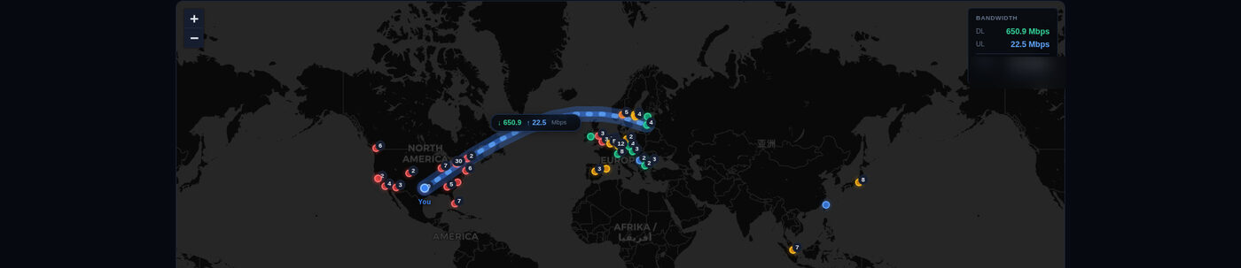
Tables are practical, but the map view is where I had the most fun. It’s a dark-themed Leaflet.js map with a marker at every AirVPN server city, color-coded by privacy tier. When I’m connected, an animated arc traces the path from home to the active server, and it reacts to real traffic. The line gets thicker as throughput climbs, the animation speeds up with bandwidth, and a little label floats on the arc showing live download/upload speeds. Clicking any city marker pops up a mini table of that city’s servers with load bars and individual connect buttons.
Building animated visuals against a live VPN connection is a pain, so I added a simulation mode: it picks a random server and generates fake-but-realistic bandwidth out of layered sine waves with random bursts. I could iterate on the arc rendering all day without ever touching the actual tunnel.
Privacy scoring, because why not
Once I had all the server data flowing, I kept going: every country gets scored on Eyes Alliance membership (5/9/14 Eyes), SIGINT Seniors participation, mandatory data retention laws, and GDPR coverage. Servers land in tiers from Excellent (Romania, Switzerland) down to Poor (US, UK), with tooltips explaining why. There’s a “Connect to Best” button that combines privacy tier with load, bandwidth, and latency into a composite score and just picks the winner for me.
Necessary for my use case? No. Interesting to build? Very.
Keeping the stack boring
I deliberately kept the tech simple. The backend is a single FastAPI app that proxies the AirVPN and Gluetun APIs with a bit of caching. The frontend is vanilla JavaScript, CSS, and HTML in a single page. No framework, no build step, no node_modules folder that outweighs the app. The whole thing is one Python file, one JS file, and one stylesheet, shipped as a Docker container that sits next to Gluetun in my compose stack, deployed via Komodo in my case.
There’s something satisfying about a project where the architecture diagram fits in a README code block: browser → FastAPI → Gluetun, with the AirVPN API off to the side.
The whole thing exists because a two-minute chore was mildly irritating, and it taught me more about VPN infrastructure and intelligence-sharing alliances than I went looking for. I use it every day, which is more than I can say for most of my side projects.